 Akacen Media
E-Commerce & Marketplaces
Product Page Checklist: What Every Product Page Should Include
Chapter 01 · Short answer
The short answer
A good product page has a clear title, strong photos including a scale and in-use shot, scannable details on size, materials and contents, an honest total price with delivery, visible returns and contact information, real proof, and one obvious call to action. It answers every buyer question before it is asked.
The elements every product page needs to convert visitors into buyers: structure, photos, copy and trust signals.
Independently researched
Affiliate disclosure: Akacen may earn a commission if you buy through links on this page, at no extra cost to you.

How we review and verify tools
- Features, plans and trials are checked against the merchant's official website.
- We cite independent sources and never publish invented prices, ratings or guarantees.
- Paid partner links are always disclosed and never change what we write.
- Pages are re-checked and corrected when merchants change their offers.
Key takeaways
Akacen Media Verified Summary
- Answer buyer doubts in order using clear bullet points.
- Photos, including scale and in-use shots, carry more weight than copy.
- Show the full price and delivery cost before checkout.
In this guide
Key highlights
Titles, photos, details, pricing, trust signals, mobile checks, calls to action and how to keep improving the page.
Key highlights
- 1Pages should answer questions before buyers ask.
- 2Scale and in-use photos persuade best.
- 3Honest pricing prevents abandoned baskets.
- 4Real proof beats invented claims.
- 5One clear button keeps the path obvious.
Chapter 02 · Practical guide & setup
Practical guide & setup
Context and priorities
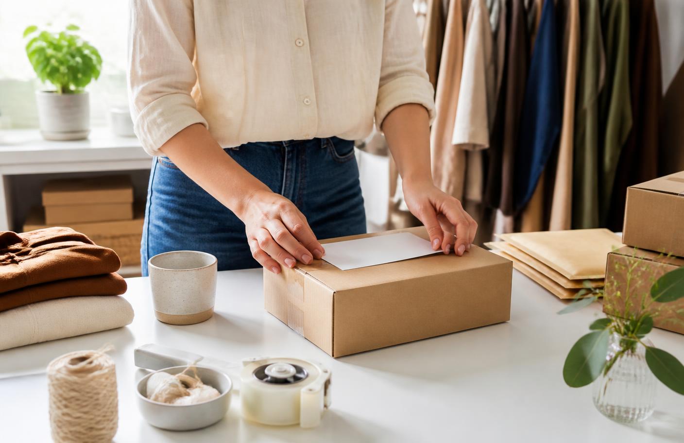
What should a good product page include? It should answer every question a hesitant buyer has before they think to ask it. Traffic is expensive to win, and a weak product page wastes it. Fixing the page is often the cheapest way to improve sales.
Think of the page as a salesperson who never sleeps. A shopper in a physical shop can pick up the item and ask questions. Online, your page must replace both, using photos, clear wording and visible policies.
Answer buyer doubts in order using clear bullet points.
Related reading: How to Start an Online Store With No Money: Step-by-Step
Start with the title. It should say what the item is and who it is for, not just a brand name or code. A buyer scanning search results or a feed decides in a second whether the page is worth opening.
Next comes the first image. Show the product plainly, on a clean background, filling the frame. This image appears in search, on social posts and in listings, so it must be recognisable even when it is small.
Then add more photos, because images carry more weight than copy. Include a scale shot, a detail shot, the back or underside, and at least one image of the product in use. The in-use picture often does more than any adjective.
Keep your photography consistent across the store. Use the same lighting, background and angle style for every product. A consistent set of images looks professional and makes the whole shop feel trustworthy, even on a small budget.
Write a short opening description that leads with the main benefit. Say what the product helps the buyer do, in plain language. Skip vague phrases such as high quality or best in class unless you can back them up.
After the opening, remove doubt in order. What is it made of? What size is it? What is in the box? How long until it arrives? What happens if it is wrong? Bullet points beat paragraphs here, because buyers scan.
Putting the approach into practice
Include exact measurements and, for clothing or fitted items, a size guide. Sizing confusion is a leading reason for returns. A clear chart with measurements in the units your buyers use reduces both returns and questions.

Be specific about materials, care instructions, compatibility and any limits on use. If the product works with certain devices, models or sizes only, say so near the top. A buyer who discovers a mismatch after paying will not return.
Price honestly and visibly. Show the full cost, including delivery, where you can. Surprise charges at checkout are among the most common reasons people abandon a basket, so state delivery costs and times on the product page itself.
If you offer options such as colour or size, make the selector obvious and keep the price and photo in step with each choice. A buyer should see the right picture change as they select, with no guessing.
What does a weak page cost you? Every visitor who leaves with an unanswered question is a sale you paid to attract and then lost. Small page improvements apply to all your traffic, so they pay back on every future visit.
Show trust signals where doubt appears. Real reviews, a plainly worded returns policy, a contact method that clearly reaches a human, and secure payment information near the button all reduce hesitation. Place them close to the decision point.
Never invent reviews, ratings or sales figures. Fake proof can break consumer rules and destroys trust when discovered. If you have no reviews yet, say so honestly and offer a clear returns policy to lower the perceived risk.
Ask early buyers for feedback and, with their permission, add it to the page. Specific comments about fit, quality or delivery persuade better than a general five-star mark. Show the good with the bad, because a perfect score looks suspicious.


Trade-offs and checks
Add a short question-and-answer or FAQ section for the points buyers raise most. Delivery time, returns, care, compatibility and warranty are common topics. Answering them on the page saves you messages and removes reasons to leave.
Related reading: Marketplace vs Your Own Online Store: Which Is Better?
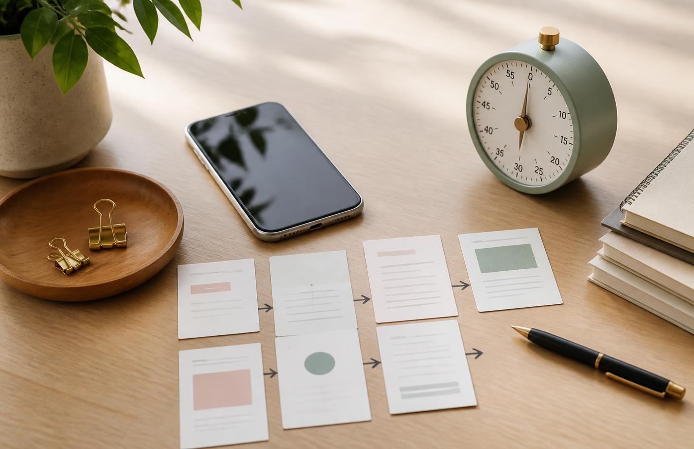
Think about mobile first. Most shoppers browse on phones, so check how your page looks on a small screen. Images should load quickly, text should be readable without zooming and the button should be easy to tap.
Page speed matters more than most beginners expect. Large, uncompressed images slow the page and push visitors away. Resize photos to the size they appear and use the compression options your platform offers.
Make the call to action obvious. Use one clear button, with wording that says what happens next, such as Add to basket. Repeat it as the page gets longer, so a buyer never has to scroll back up to act.
Pages that offer visitors five equally weighted choices usually convert worse than pages that offer one. Keep secondary links, such as size guides or policies, quieter than the main button, so the main path stays clear.
Check your wording for clarity and tone. Write the way you would explain the product to a friend. Short sentences, plain words and concrete details persuade better than hype, and they read well on a phone.
Include basic search information as well. A clear title, a unique description and descriptive image names help search engines understand the page. Do not stuff keywords. Write for the buyer first, and the search benefits follow.
Before you decide the page is finished, read it as a stranger. Open it on your phone, ignore what you know, and ask whether you would trust it. Better still, ask a friend to find the delivery cost and returns policy.
Making your next decision
Use a short checklist. Is the title clear? Are there at least four useful photos? Are size, materials and contents stated? Is the total price visible? Are policies and contact details easy to find? Is there one obvious button?

Test one change at a time. If you rewrite the title, swap photos and change the button on the same day, you cannot tell which helped. Make a change, wait for enough visits, and then compare results.
Review the page after your first orders. Look at the questions buyers ask and the reasons for any returns. Each repeated question is a gap in the page, and filling it is usually quicker than answering messages forever.
Handle returns and warranty information clearly. State the return window, who pays for postage and how refunds are issued, using wording you can honestly stand behind. Check consumer rights rules where you sell, because some requirements apply regardless of your own policy.
Consider adding cross-sells carefully. A related item, such as a case, refill or matching accessory, can raise the order value. Place it below the main button so it supports the decision instead of distracting from it.
Keep the page accurate over time. Update stock status, delivery times and prices when they change. An out-of-date page that promises something you cannot deliver causes complaints, refunds and bad reviews.
Related reading: How to Find Products to Sell Online Before You Spend Money
Confirm any claims you make with evidence. Statements about safety, health, performance or materials can carry legal requirements in some places. Check the rules with official sources, and avoid promises you cannot support.
The verdict: a good product page is clear, honest and complete. Lead with a plain title and strong photos, answer doubts in order, show the full price, add real proof, and finish with one obvious button. Improve it with every batch of questions.


Chapter 03 · Key highlights & takeaways
Key highlights & takeaways
- Answer buyer doubts in order using clear bullet points.
- Photos, including scale and in-use shots, carry more weight than copy.
- Show the full price and delivery cost before checkout.
- Use one obvious button and check the page on a phone.
Watch out for: Never invent reviews, ratings or sales numbers, and do not make safety or health claims you cannot support.
Practical steps
- Write a title that names the item and its buyer.
- Shoot four or more consistent photos, including scale and use.
- List size, materials, contents, delivery and returns in bullet points.
- Add honest proof, one clear button and test on a phone.
People also viewed
Chapter 04 · Before you decide
Pros, cons & decision checklist
Pros, cons and who it suits
Pros
- ✓ Pages should answer questions before buyers ask
- ✓ Scale and in-use photos persuade best
- ✓ Honest pricing prevents abandoned baskets
Cons
- – Never invent reviews, ratings or sales numbers, and do not make safety or health claims…
- Best for
- Readers who can confirm this: Buyers recognise it is for them at a glance
- Skip if
- Never invent reviews, ratings or sales numbers, and do not make safety or health claims…
Three checks to make before acting on this guide.
| Check | What good looks like |
|---|---|
| Title names item and audience | Buyers recognise it is for them at a glance |
| Total price and delivery visible | No surprises appear at checkout |
| One clear call to action | A single button stays easy to find and tap |
Verdict: start with the smallest reversible version, then expand using real results.

Chapter 05 · FAQ
Frequently asked questions
How many photos should a product page have?
Use enough to answer buyer questions.
Should I show delivery costs on the product page?
Yes.
What if I have no reviews yet?
Be honest about it and offer a clear returns policy.
How long should a product description be?
Long enough to answer key questions and no longer.
Does the page need to work on mobile?
Yes.
How do I know what to improve?
Read the questions buyers ask and the reasons for returns.
Chapter 06 · Final verdict & next steps
Final verdict & next steps
Clarity and honesty convert better than hype.
Let buyer questions guide each improvement.
Check every change on a phone.
Do this next
Your next steps
- 1Write a title that names the item and its buyer.
- 2Shoot four or more consistent photos, including scale and use.
- 3List size, materials, contents, delivery and returns in bullet points.
- 4Add honest proof, one clear button and test on a phone.
Keep reading
Sources: official vendor pages where a product is mentioned. Last reviewed 15 September 2026; prices are not quoted here, so confirm current prices and terms on the official site.
What to do next
Pick the smallest useful step from this guide and complete it before adding another tool or plan.
Related guides
- How to Start an Online Store With No Money: Step-by-Step
- Marketplace vs Your Own Online Store: Which Is Better?
- How to Find Products to Sell Online Before You Spend Money
- How to Get Your First Customers Without Paid Ads
- Explore E-Commerce & Marketplaces
- Browse every Digital Business topic
- See the full index of guides
Akacen Media editorial team
Independent, practical publishing
Akacen Media covers online business, money, security and software. Guides combine careful research with practical checks, clearly marked partner links and no paid rankings.
About Akacen MediaHow we reviewContactYouTubePinterestInstagramTikTok
Some links on this page are affiliate links. If you sign up through them we may earn a commission at no extra cost to you.
Read more about who publishes this on the publisher profile.